
Going mobile can no longer be classified as the “next step” in our digital world—we are already there! Smartphones and tablets are now the prominent platforms to access the internet, but rest assured desktop and laptop computers are nowhere near from disappearing off retail shelves, yet. It all boils down to programming and coding. If the website is not programmed to be responsive then the display of a website through a desktop platform is completely different to the display from a mobile device. Read on to learn more about the value of responsive websites and how this affects mobile search and SEO rank for your business.
As of 2015, research shows that 80% of internet users own a smartphone, 47% a tablet, and 37% a game console. There’s no question that you’ve noticed a difference in website design and structure if you’ve searched anything on the internet through these devices. Although most businesses have welcomed responsive design with open arms, some are still not fully aware about how this coding changes their website from a functionality, layout and SEO perspective.
Layout
Screen sizes are forever changing and it’s important for a website to adapt to current and future sizes. The site layout should be flexible depending on the size and capabilities of the device. For example, smartphone users may see content shown in a single column, but tablet users might see the same content in two columns due to the larger screen resolution. You also have to consider font size, spacing and touch/respond efficiency.
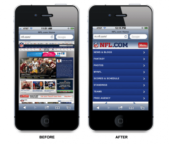
Take a look at how NFL.com’s website is displayed before and after becoming responsive. The before image shows exactly how the website appears on a desktop computer. Look at the small font size and how close the buttons are together. You could zoom-in to get to where you need to go, but then you run into the frustrating challenge of selecting the correct graphic link amongst the crowded options. Now look at the fully-functional, responsive after image. The website may not be as flashy as the desktop version, but it’s organized for convenience so you can find what you’re searching for quickly.
Website user experience with easy navigation and layout is more critical than ever when it comes to mobile viewers. If internet users are increasingly using mobile devices to access your website, reference the images above and confirm you are doing your business a benefit and offering a responsive website that scales across devices. You can still appreciate your beautiful and functional desktop website, but don’t forget that recognizing your mobile audience is another incredible opportunity for website success.
Mobile SEO Rank
Many business owners fail to realize that organic search rank is separated into individual grades and not just an overall “score” for their website. A site viewed from a laptop might rank well organically, but has the potential to never show up in mobile searches if it’s not optimized correctly. As more users access your website from their phones and tablets, your site is building a mobile reputation—good or bad. In the past, hiding from Google’s mobile ranking was easy for websites, however, this is going to change soon due to upcoming changes in Google’s mobile ranking algorithm.
Beginning in April 2015, Google’s mobile ranking factors will be able to label your website as mobile-friendly and use this status to evaluate your site’s overall rank. At this point in time mobile users will find it’s much easier to get relevant, high quality search results that are optimized for their devices. Since this was recently announced and not taking place until April, businesses have some time to invest in updating their code to make their websites responsive. That being the case, if your goal is to rank high in organic search and Google is rewarding websites for being mobile-friendly, why wouldn’t you take the next steps to improve your website’s SEO?
The good news here is that reformatting your website to be responsive doesn’t always mean you are starting from scratch. Many site templates are simply re-worked and the content doesn’t have to change. It’s time to embrace responsive design and revel in the SEO benefits your website will gain.
Think it’s time for your business website to go mobile? Great! Sage Island can help. Our team of programmers will look at its current framework and code to then determine the steps needed to launch a fully-functional, responsive website that guides to users to the answers they’re looking for.